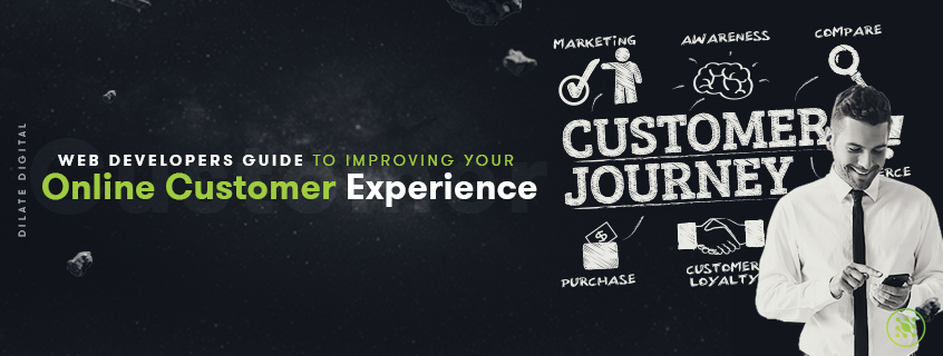

It doesn’t take a rocket scientist to figure out that brick-and-mortar is out, and ecommerce is very much in. So what that means for you as a business owner is that, even if you have a physical location, you better believe you need a virtual location to match. In truth, today’s world is fast-paced, convenience-based and growing more and more digital by the day. So to survive as a business owner you not only need a digital presence, you need a damn good one, too. That’s why investing in a holistic digital marketing strategy is absolutely essential for all businesses. A good marketing strategy is one that truly considers every single touch point a customer might have with your business before making a purchase, and then curates a streamlined and intentional journey for that customer. At Dilate Digital, we’re a collective team of marketers, advertisers, graphic designers, content creators, strategists, web designers, and web developers. Our web designers and web developers are highly experienced in building websites that create engaging and intuitive online customer experiences and journeys; curating a purpose-built a website with each individual element uniquely designed to fulfil a particular purpose. Today we are sharing our web developers’ collective guide to help you improve your customers’ online journey on your website. Without further ado, here’s how web design can help your business thrive.
 Ease of use is one of the most essential factors of a successful website. That means that your navigation, both header, and footer, should be obvious and easy to navigate through. Dead links, illogical menu placement, and fiddly menus should be steered clear of. If you have unnecessarily complex and complicated navigation, customers will get frustrated and jump ship. In fact, a massive 57% of online shoppers reported that lousy navigation was a primary reason for not completing a purchase.
 Loading time is another one of those “essential factors” of a website. You would know from personal experience how infuriating it is when a computer freezes, when a slow driver sits in the right hand lane, when a website takes forever to load. The truth is time is of the essence, and we all have places to be, things to do, people to see - and wasted time is wasted money. It’s crucial your website honours that value by ensuring you have efficient website speed. A ten second load time can cut your visitor numbers in half.
 Like everything, we want it to be easy, and we want it now. Matter of fact, we wanted it yesterday. Your checkout should mirror this attitude and ensure the entire checkout process is as uncomplicated as feasibly possible. The more complex and drawn out your checkout page is the less likely you’ll be able to convert. Think about your own personal experiences for a second. Remember the last time you went to make an online purchase, but then they made you sign into an account, recite the Australian anthem, and spell your mother’s maiden name backwards four times whilst balancing on your left foot? Yeah. We threw that in the too hard basket as well. If your website is experiencing a lot of abandoned checkouts, it might be time to go back and revisit the old checkout whirlwind you’ve been taking your poor customers on.
 Help pages, support and FAQ pages are great ways to ensure your customer experience is much smoother and more manageable. It helps to easily facilitate customer concerns and negate small issues that they may encounter during their customer journey with you. Ideally, your FAQs should address common concerns and problems that a customer might experience whilst on your website. Not only will this mitigate any possible future issues with this customer but it will also allow them to learn more about your business, helping to build trust and credibility.
 Think about this for a second: If you were reading this blog and it had no headers, subheaders, white space, links, and images, you’d probably have a hard time keeping focus. It would feel like a text overload. A bit too much to digest. But then we add in a nice big header, we split it into multiple sections with headers in bold. We utilise lists and relevant imagery, and suddenly you’ve already read four pages on our blog, rather than the first four sentences of our first blog before you bounced. Why? We’re visual creatures, and imagery helps us to consume information easily, especially when it’s relevant within the context of the articles (which is an important factor here: ensure your imagery makes sense). If you’re an ecommerce site. It’s important to use a variety of different images at different angles for the same product. It helps potential customers gain more of an all emcompassing feel for the product and allows them to confidently invest in your product without any buyer’s remorse. You could go one step further if you have the resources and include video demonstrations in your site. People wearing the product or walking you through how a product or service works helps to create a more engaging experience for the potential customer.
 A credible social media presence and strong customer review base is becoming more and more significant for online businesses. As consumers are demanding more transparency and relying more heavily on third-party reviews to validate products, it’s essential you play into this need.
 Notifications don’t need to be complex, they can be simple, but well considered. Letting customers know when a product is out of stock or back in stock is a great example of automated notifications. Perhaps a notification allowing customers to know that there’s only one left, or that there are only three more days to buy a particular product before it goes off the shelf. All these little notifications are simple ways to ensure you’re communicating effectively with your customers. You might know from personal experience how disheartening it is to spend a great deal of time finding the right specific product, only to get to the checkout and realise that it’s no longer available, or not in the right size or colour. If you don’t enjoy that experience, chances are that your customer doesn’t either. Getting customers to your website is one part of your business, but making them stay? That’s another strategy altogether, and one that many still don’t do all that well. But for the businesses in the know, the businesses that understand the importance of investing in their web development and customer journey, they’ve got the competitive edge. If you want to get ahead of your competition and wow your customers with seriously seductive customer experiences, speak with one of our web developers in Perth today.
what our clients are saying
create business. better everyday.
Let's Talklearn from the best minds in the business
Bodie provides some insight into Dilate's internal operations. How we approach what we do, and how we strive to be Better Everyday.


