

Great creative is the lifeblood of impactful marketing. It’s the difference between a campaign that makes people pause and one that fades into the background faster than you can say, “Skip Ad.” But let’s get one thing straight—good creative isn’t just about looking nice. It’s about strategy, precision, and, most importantly, making people feel something.
In this guide, we’ll cover everything you need to know about mastering the art (and science) of creative. From nailing the technical details to creating emotional connections, this isn’t fluff—this is your roadmap to creative that actually works.

Bloomeffects – An award-winning skincare brand pioneering clean beauty with upcycled tulips to brighten, nourish, and restore the skin.
If you’re building a house, you don’t start with the skylight—you lay the foundation first. The same goes for creative. Before you can dazzle anyone with emotional storytelling, you need to get the technical stuff right.
Visual hierarchy is like the satnav of your creative—it guides your audience exactly where you want them to go. Done well, it makes your message impossible to miss and easy to follow.
Take Canva’s interface as an example. Everything is intentionally placed: bold headings direct your focus to key tools, clean layouts prioritise usability, and eye-catching buttons (like “Create a Design”) steer you towards taking action. It’s not just design—it’s effortless guidance toward the next step.
To build strong hierarchy in your work, think about size, placement, and contrast. Headlines should be bold and unmistakable. Use colour contrasts to draw the eye, and position key elements in spots people naturally gravitate towards (hint: the upper left or centre).
Three tips for better visual hierarchy:
Colour isn’t just decoration—it’s persuasion. Think of Woolworths’ green, which evokes freshness and sustainability, or Netflix’s bold red, which signals excitement and energy. These colours aren’t chosen randomly—they reflect what the brands want their audience to feel.
Want colour to pull its weight in your creative? Stick to a focused palette of three to four colours that represent your brand. Use contrast to make calls-to-action pop (a bright green “Get Started” button on a white background is practically shouting at your audience to click).
Three tips for better colour use in design:
Accessibility isn’t just nice to have—it’s a must. After all, what’s the point of amazing creative if half your audience can’t engage with it? ABC iView demonstrates this perfectly. Its intuitive navigation, high-contrast text, and closed captions ensure that its content is accessible to users of all abilities.
Make your creative inclusive by using legible fonts, avoiding microscopic text sizes, and always adding alt text for images. Accessibility tools like Google Lighthouse can highlight areas for improvement. Bottom line? Accessibility doesn’t just widen your audience—it makes your creative better for everyone.

HRportal – A comprehensive HR resource hub with Australian-compliant templates, policies, and a community forum for business leaders.
Technical excellence might grab attention, but emotion is what makes it stick. People don’t remember what you said as much as how you made them feel.
If you’re not speaking your audience’s language, you’re just shouting into the void. Spotify’s Wrapped campaign is a textbook example of nailing this. They didn’t just show data—they made it personal, wrapping up users’ listening habits into bite-sized stories of their year. And because it tapped into something deeply personal (identity), people didn’t just engage—they shared it everywhere. It’s even one of the most mimicked marketing campaigns of the year
How do you do this? Get to know your audience. What are their challenges? Their passions? Are they data-driven professionals or meme-loving Gen Z-ers? Tailor your creative to hit their sweet spot. If you can articulate your audience’s problem better than they can, they’ll trust you to solve it.
Stories aren’t just for bedtime—they’re what make brands unforgettable. Bupa’s “This Is Health Insurance” campaign took an industry often seen as dull and turned it into something human. By showcasing real families and their health journeys, they made a potentially dry topic relatable and emotionally engaging.
When crafting your own stories, focus on authenticity. A simple narrative with a relatable problem, a solution, and a transformation can be more powerful than a big-budget epic.
Emotion drives decisions—full stop. Airbnb doesn’t just sell holiday homes; it sells connection and adventure. Their marketing makes you feel like booking a weekend away will magically fix your life.
To tap into emotions, think about what you want your audience to feel—nostalgia, excitement, urgency—and design every element to amplify that. Pair emotional copy with visuals or music to make it even more powerful.
How to do it:
A great emotional hook paired with the right design can turn a passive audience into engaged customers.

Melville Mazda – A trusted Mazda dealer offering new, demo, and used vehicles, along with expert servicing and genuine parts.
The best creative doesn’t live at one extreme or the other. It’s the perfect blend of technical precision and emotional resonance.
Start with a clear, actionable brief. Don’t just say, “Make it fun.” Instead, specify what “fun” means: “Create a playful ad for millennial professionals that highlights the simplicity of our service.” Be clear about both technical details (platforms, formats) and emotional goals (tone, audience reactions).
Once you’ve got your plan, test it. A/B testing, prototypes, and feedback loops will help you fine-tune until your creative is firing on all cylinders. Tools like Optimizely or UsabilityHub can be your best mates here.

Perth City Prestige – A leading automotive dealer group representing Škoda, Subaru, Deepal, and Perth City Car Rentals.
Good creative isn’t bound by a single medium. Here’s how to apply these principles across different formats.
Social media is where attention spans go to die. Keep it short, sharp, and striking. For example, an Instagram ad for Afterpay might feature a clean, stylish product image with the text, “Shop Now. Pay Later. Interest-Free.” The simplicity sells the solution.
Video is storytelling on steroids. NRMA’s “Help Is Who We Are” campaign combined real-life rescue stories with emotive visuals to highlight their core value of reliability. Hook viewers in the first five seconds, use captions for accessibility, and ensure the story reinforces your brand message.
A good website doesn’t just look pretty—it works. Qantas’ site combines clean functionality with striking imagery to evoke a sense of exploration. Fast loading times, mobile responsiveness, and intuitive navigation make it easy to book a trip, while the visuals make you want to book it now.

Udio – A powerful all-in-one class management platform that streamlines bookings, student interactions, and operations for class-based businesses.
Even experienced creatives fall into traps. Here’s what to watch out for:
Clutter kills creativity. Keep your designs clean and your messaging simple. Use the “1-3-5 Rule”: one main idea, supported by three key points, in no more than five seconds of reading time.
Trends can give your creative a boost, but they’re no replacement for a solid strategy. Duolingo nailed TikTok by combining viral trends with their quirky brand voice, showing how trends work best when they support your long-term goals.
Creative isn’t just the icing on the cake—it’s the cake, the plate, and the fork. It’s what drives growth, builds loyalty, and keeps your brand ahead of the pack.
At Dilate, we don’t just create campaigns—we craft experiences that connect, inspire, and deliver. If you’re ready to create something your audience won’t forget, we’re here to make it happen.
create business. better everyday.
Let's Talklearn from the best minds in the business
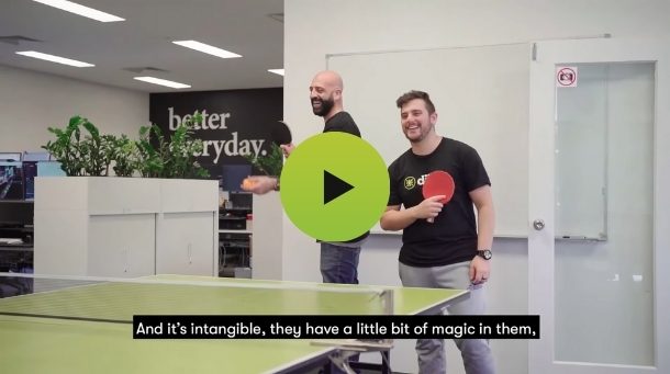
Bodie provides some insight into Dilate's internal operations. How we approach what we do, and how we strive to be Better Everyday.


