


Contents
Mobile Web Design Principles for a Good User Experience

Nov 09, 2023
By Chelsea Knoll
Mobile apps are now a big part of our daily lives, changing how we shop and communicate online. It's crucial for businesses and website creators to focus on making their websites work smoothly on mobile devices.
Mobile web design isn't just about making your website look stellar on smaller screens. It's about having a seamless and enjoyable experience while interacting with the website on tablets or mobile devices. A good mobile user experience (UX) can lead to increased engagement, higher conversion rates, and improved brand loyalty. Creating good mobile designs that support exceptional UX has become crucial for businesses and website designers.
So how can you make your mobile web design effective?
Simplify menus with intuitive navigation
Think of effective navigation as the foundation of a successful mobile website. It's like having clear signposts on a road trip – users need to easily and quickly find what they're looking for without getting lost or frustrated.
Why intuitive navigation matters
- Enhanced User Engagement: Easy navigation encourages users to explore and spend more time on your site.
- Lower Bounce Rate: Users who can easily access the information they need are less likely to leave your site immediately.
- Increased Conversions: Clear and intuitive navigation can guide users toward conversion points, such as making a purchase or filling out a contact form.
- Positive Brand Perception: An intuitive mobile experience reflects positively on your brand, conveying professionalism and user-centricity.
The challenge of mobile navigation
Mobile devices vary in size, but even the biggest smartphones have relatively small screens compared to desktop computers. This small screen space creates a special challenge for web designers and developers. Unlike on desktop websites, where you have plenty of room for big menus and lots of navigation options, mobile users deal with limited space.
This limitation makes it inconvenient for users to scroll through long menus and sub-menus to find what they want. It's like trying to find a specific item in a packed closet – it can be frustrating and time-consuming.
The art of simplifying menus
One important part of making navigation easy on mobile devices is keeping things simple when it comes to menus. Simplifying menus means organising them in a way that's straightforward and user-friendly. This helps people move around the website smoothly, just like clear road signs make your journey easier.
While primary menu items should be limited, using submenus for deeper navigation is acceptable. Menu item labels should be clear and concise—use plain language that is easily understood by a broad audience. Avoid jargon or overly technical terms that might confuse users.

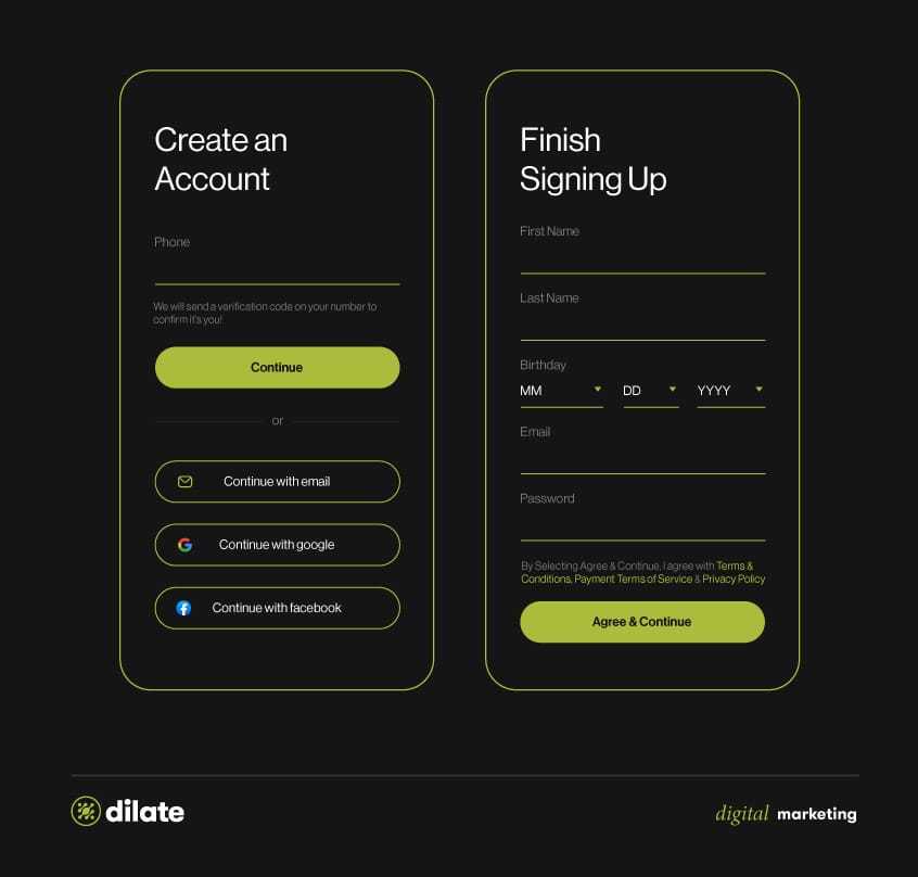
Design mobile-friendly forms
Forms are essential for gathering user information, but can be challenging to design well on mobile devices.
Shorten contact forms
Say, you're on your smartphone, trying to subscribe to a newsletter or complete a purchase, and you're confronted with a seemingly endless array of fields to fill out. It's an all-too-familiar scenario that can frustrate even the most patient users. This is precisely why shortening contact forms is paramount for ensuring a smooth mobile user experience.
When designing mobile forms, adopt a minimalist approach. Ask only for the information that's absolutely necessary. For instance, the customer's name and email address is enough for a newsletter subscription. If you require additional information for specific actions, like making a purchase, consider using progressive profiling. This technique allows you to collect additional details gradually over time, sparing users from being overwhelmed with a long-form upfront.
Make use of a variety of form fields
Diversifying the types of form fields used in your mobile forms is a brilliant way to simplify the user experience. By offering options like checkboxes, dropdowns, and calendars, you can enable mobile users to search effectively and input information without excessive typing, which can be cumbersome on smaller devices.
Create mobile-friendly forms
- Respect your customers' time: In the mobile world, convenience is king. Streamline the process as much as possible. Lengthy and cumbersome forms can deter users from completing their tasks.
- A/B Testing: When you're unsure about the optimal form length, conduct A/B testing with different versions. User feedback and data-driven decisions can help fine-tune your form strategy, ensuring that it aligns perfectly with your users' expectations.
- Autofill for Returning Users: Implementing features like autofill can significantly speed up the form-filling process for returning visitors. This saves time and reduces friction, resulting in higher user satisfaction and potentially increased conversions.
- Guest Checkout: For ecommerce websites, consider adding a guest checkout option for customers who prefer not to create an account. This streamlined approach caters to users who value convenience and helps increase the completion rate of the checkout process.
Build connections with your audience through mobile websites
A successful ecommerce site thrives on seamless communication with its users, and this involves two key components: accessible contact details and a comprehensive FAQ section. When it comes to mobile-friendly design, these elements become even more critical as they form the backbone of seamless communication with your users.
Contact details: multiple paths to reach out
It's important to give users different ways to reach your business. One of the most important features for your mobile app is a big "call us" button that's easy to find. This makes it simple for users to get in touch with your team with just one tap. Calling is great because it offers immediate help and builds trust between your business and the customer.
But not everyone likes talking on the phone. That's why it's also important to have a short contact form on your website. A well-made form lets users send questions, ask for help, or give feedback without making a call.
You might also want to show your business's email address, as some people like using email. The goal is to include everyone. By offering different ways to get in touch, your business shows it cares about what works best for each customer. This makes for good user experiences and successful customer interactions.
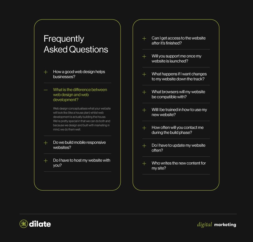
Add a knowledge-rich FAQ's page
A great FAQ (Frequently Asked Questions) section is like a helpful guide that quickly answers common customer questions. It's like your website knows what people might ask and provides the answers in advance.
When you create your FAQ section, be sure to organise it well, so it's easy to find what you need. Make it clear and easy to search. A well-structured FAQ saves users time and keeps them from getting frustrated, making their experience on your mobile website smoother.
Including these elements in your mobile designs is all about making things user-friendly and engaging. It helps users find answers to their questions, making it easier for them to connect with your business in a way that works for them.
Keep users engaged with fast mobile web responsiveness
Smartphones have changed how we use the internet. Whether we're shopping, reading news, or talking to friends, mobile devices have become our go-to tools. So, if websites don't work well on mobile, they risk losing a lot of users.
In today's connected world, where information is easy to find with a tap, keeping people interested on your website is tough. Since most people use mobile devices to browse the internet, it's super important to make sure your website works well on them. It's not just about making your stuff fit on small screens or looking nice. It's about giving users a great and consistent experience on mobile.
Why mobile web responsiveness matters:
- User Expectations: Mobile users demand websites to load quickly and look great on their devices. A responsive design ensures your site meets these expectations, leading to higher user satisfaction. And users who can access your content quickly are more likely to stay and engage.
- Improved Accessibility: A responsive website is accessible to a wider audience. This inclusivity can help you tap into new markets and demographics.
- SEO Benefits: Google, the world's most popular search engine, rewards mobile-friendly websites with higher search rankings. A responsive design can significantly boost your site's visibility in search results, driving organic traffic.

Convert your mobile visitors to loyal customers

Getting a great experience on mobile isn't just about making things look good—it's a big part of doing well in the digital world as a whole. Businesses and web developers need to understand that mobile design isn't something you just check off a list—it's the key to keeping customers happy and loyal.
Interested in learning more? Get in touch with us. At Dilate Digital, we can help you design and build a mobile-friendly website to make your customers' shopping experience seamless and enjoyable. Let’s talk, and convert your mobile visitors to loyal customers!


