
Have you ever been on a website that made it really hard to find what you were looking for? Maybe you’ve been on a site that took forever to load or one that was so full of information it gave you a headache?
We’ve all been on a website that wasn’t a great experience and often the issue comes down to poor design. When a web designer fails to think about how it would feel to be in our position using the website, there are going to be issues.
All websites should be designed with the user in mind because the end goal of any design should be an excellent user experience. Granted, achieving a positive user experience isn’t always easy. But it sure is worth it.
 What does UX stand for?
UX stands for User Experience. It basically describes what it’s like for a user to interact with a product/service/website. In web design, UX principles are the things designers do to make a user’s interaction with a website as enjoyable and painless as possible.
A related term is UI which stands for User Interface. You can think of UI as the combo of content, form and behaviour on a website. A really simple way to understand the difference between UI and UX is: UI is about how things look, while UX is about how things work.
 Why is UX important?
The field of UX design is interested in creating experiences that are enjoyable. UX is important because it helps you create a website that anticipates what your audience needs. It helps you give your users a positive experience. And why is that so crucial?
Imagine walking into a physical shop where the service is terrible, the wait time excruciatingly long, and the products are difficult to find. Would you be willing to spend your money there? How likely are you to return?
The same goes for a website. UX design principles are all about creating an experience that is pleasurable, hassle-free and seamless from start to finish. Websites with killer UX will keep people on the website longer, help create a loyal audience and improve the chance of business success.
Convinced and ready to get started? We recently shared some tips about creating a great web design, but today we’re sharing with you a list of the 10 best UX practices that you can use to improve your website today.
 1.User experience should be at the heart of website design
What’s more important: what your website says or how the users of your website feel after using it? I would vote for the second option. More often than not, users forget what exactly they’ve read on a website, but their impression of the website will stick with them. If you can create a positive and memorable experience for your users, you’ll start reaping the benefits of good UX.
That’s why right up the top of these tips we’re making it clear that UX should be a driving force for all website design choices you make. If UX is not at the core and centre of web design, you might end up pushing users away, and sending them off to your competition. No one wants that. Do yourself a favour and make UX a top priority.
When deciding how to include graphics and interactive elements, and how to best use whitespace, typography and text, UX should help point you in the right direction. How to present your content, guide your user through your website and lead them where you want them to go: all of these need to work together to create a positive UX to make sure your users are enjoying their time on your website.
 2. Understand your audience
Designing any website without a clear idea of who the audience is would be a waste of time. Why? Because your audience will influence the UX decisions you make. If you know who will be interacting with your website, you’ll be able to create an experience that is satisfying and engaging for them.
You should take time to consider the needs and wants of your audience and tailor your website towards these. Ask yourself: what are their desires, and what are their limitations? Do some research into your competition, and create simple but striking ideas that will help you stand out.
Once you’ve developed a website, make user feedback a priority. Taking the time to listen to your audience and their experience on your website can be really valuable in upping your UX game even more.
 3. Aim to be clear and simple
“Don’t make me think” is a popular saying in the UX web design world. It means users don’t want to work hard when they’re on your website, and if they have to, they’re probably going to go somewhere else. Sometimes it only takes a few seconds for a user to decide if they’re going to stay on a website. And if they can’t find what they’re looking for pretty quickly they’re probably not going to stick around for long.
Keeping your website clear and simple is one of the most important UX principles. You should make key information easy to find, and don’t overcrowd your website with less important elements. These will only take the attention away from what you most want to guide your audience towards. Sometimes less is more.
The same goes for the colours and aesthetics of your website. Keeping these clear and simple will help users understand what to expect from your website without putting much effort in.
 4. Design your pages to be scanned easily
One of the reasons why it’s so important for UX to make your website simple and clear is because users don’t read pages, they scan them. Important information or tasks you want your readers to do should be obvious, not hidden away where users have to hunt for them.
The gist of your content should be understood very quickly. Readers will slow down to read parts that are of interest to them, but will be put off if they must sift through big chunks of text. Using infographics and visuals are two ways to get your point across quickly and clearly, but there are many ways to structure pages for readability.
 5. Create a visual hierarchy
Creating a visual hierarchy means making the key elements of your page stand out to draw the user’s focus. The user shouldn’t have to work hard to understand what is most important; your website’s visual design should guide them smoothly where you want them to go.
There are many ways to create visual hierarchy such as making the most important elements bigger, brighter or bolder. You can repeat styles or place elements close together to help the reader understand that they are related, and using whitespace effectively can also help make important elements draw the eye.
Keep in mind that without a visual hierarchy, readers will naturally read the page according to cultural norms. In Australia that means from top to bottom and left to right. Web designers can challenge or use these norms to their advantage, in whatever way is best for the overall UX.
 6. Use common design elements so your site is easy to navigate
Some elements of web design have become standard across the internet, and users expect these when they visit a new website. Trying to be too creative or ignoring these normalised web elements could make your website visitors have to work harder.
On the other hand, a familiar-looking interface will help users feel at home, and make it easier for them to navigate your website. The key is to find a sweet spot between creativity and familiarity: both are important and should be considered in all UX website design.
Common website elements include making links stand out, placing navigation elements at the top of the page and putting login access in the top right of the page. Doing something too out of the box means users will have to learn something new, and this goes against the principle of “don’t make me think”.
 7. Have original content that is useful
Have you ever gone on a website and the content has been unhelpful or frustratingly irrelevant? Even if a website’s content looks attractive, if it isn’t useful to the users they probably won’t be having a good experience. The readability of your content isn’t just about how easy it is to read; it’s also about whether it’s something users actually want to read.
We’ve already talked about how important it is to understand who your audience is. Using this information will help you design content that meets their needs so you can offer them something useful.
Additionally, you need to make sure your content stands out from your competitors. Yes, make your content useful, but also aim to make it original. How can you have an edge on those who are already offering your audience the same things? Original content that is useful to your audience will go a long way in improving UX for your website.
 8. Make sure your website is accessible and responsive
We’re all busy people, so if a website takes too long to respond or doesn’t load properly, we move on. To up your UX game, make the responsiveness and accessibility of your website a priority.
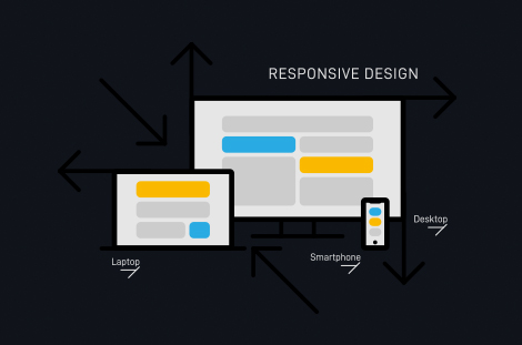
Nowadays so many users access websites on their mobile phones. So it’s really important that you don’t just design for responsiveness on computers: make sure your mobile users are taken care of too. Good UX design will make sure mobile users can interact with a website in a way that feels comfortable and natural.
Coming back to the audience point again: make sure you know the limitations and abilities of your audience. Making your website accessible to people with disabilities, easy to navigate for older people, and simple for anyone to use on a mobile device will all help improve your website’s overall UX.
 9. Be consistent
Without consistency, you will create confusion. Users won’t be able to pick up the processes on your website intuitively. Remember the point from above about keeping things clear and simple? Being consistent in design and behaviour throughout your website is a really important way to help you achieve simplicity.
Ask yourself whether or not your website lines up with your brand. Are the different pages consistent? Are you reusing colours, behaviours and aesthetics throughout the website? If you are consistent, users will know what to expect. They’ll be able to find their way around your website more easily, and this will make the experience smoother, simpler and pain-free.
 10. Be human and build trust
The last UX tip for today is about being real and being human. Even though your website is accessed using technology, who’s accessing it? A human. Website design needs to use human elements so that your audience feels connected and understood.
Be human - what does that even mean?! It’s all about being trustworthy, personal and approachable. You should create content that users can connect with emotionally and that encourages them to feel like there’s a human (or team of humans) on the other side of the website.
Websites with the best UX have done a good job at creating credible content. Everything on the website aims to be believable and trustworthy, so that users feel like they’re in good hands.
At Dilate Digital, we believe in the power of excellent UX design to help create websites that really work. We offer personalised website development services that help improve UX, increase conversion and take the stress out of it for you. From website design to superior content creation and effective SEO strategies, we help businesses all over Australia achieve their website goals.
If you think you might need help with your website, why not give us a call today and see what we can do for you?
what our clients are saying
create business. better everyday.
Let's Talklearn from the best minds in the business
Bodie provides some insight into Dilate's internal operations. How we approach what we do, and how we strive to be Better Everyday.


